Contacts redesign & credit transfer
From closed loop to open banking
The problem
Satispay's contacts page had accumulated features without a plan — no bank account support, navigation that conflicted with itself, a structure the product had outgrown. Sending money to an external IBAN meant leaving the app entirely. Not an acceptable answer for a payments super-app.
The solution
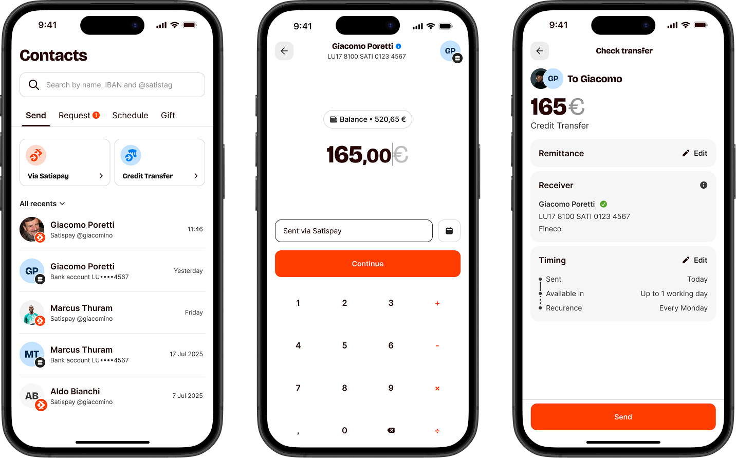
Rebuild the contacts hub and add Satispay's first open-loop payment: SEPA Credit Transfers to any external IBAN. One surface, two navigation paths, and a flow designed to make users feel safe sending large, irreversible amounts.
Bank transfers mean rules to follow
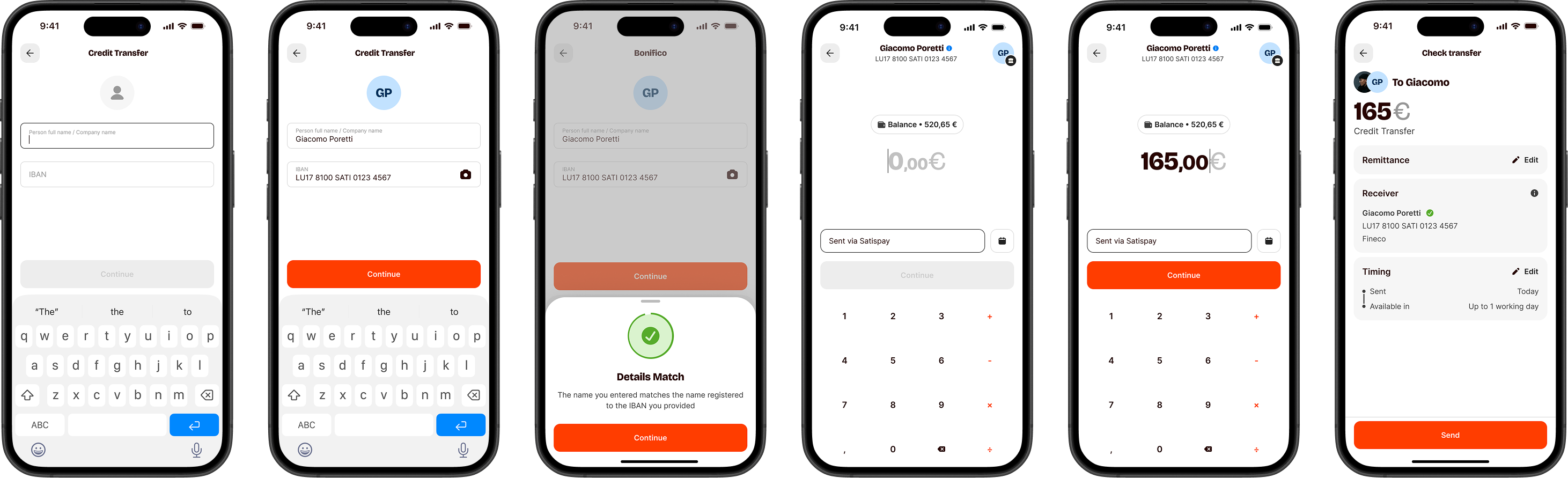
SEPA Credit Transfers come with hard regulatory requirements — and every one shapes the UX. The most critical: Verification of Payee (VoP), which mandates verifying the beneficiary's name against the IBAN before execution. Full match, partial match, no match — each state needs a clear response in the UI.
Amount limits, execution date rules, mandatory recap, irreversibility by design — each one a regulation, each one a UX decision. The challenge wasn't just building the flow. It was making compliance invisible.
What testing revealed
We ran moderated sessions to observe how participants navigated toward a bank transfer. Two patterns kept surfacing.
Two mental models, no clear winner
Some started from the person — find the contact, then choose how to pay. Others started from the action — pick "bank transfer" first, then the recipient. Both were intuitive. The interface was only built for one.
I always start from the person. I find Marco first, then I decide how to send him money.
Participant 04 · usability testI want to do a bank transfer. I don't care about the contact list — just give me the IBAN field.
Participant 09 · usability testIrreversible actions demand visible reassurance
Larger amounts, irreversible. Participants double-checked the IBAN, reread the amount, paused before the final tap. The stress was visible. Miss this moment and you lose the transaction — and the trust that took months to build.
I'd want to see the IBAN and the amount on the same screen before I confirm. Just to be sure.
Participant 07 · usability testWith this kind of money I always double-check. If I can't verify it easily I might just not send it.
Participant 12 · usability testFour decisions that shaped the design
Research didn't just validate assumptions — it handed us constraints. We turned each one into a design decision.
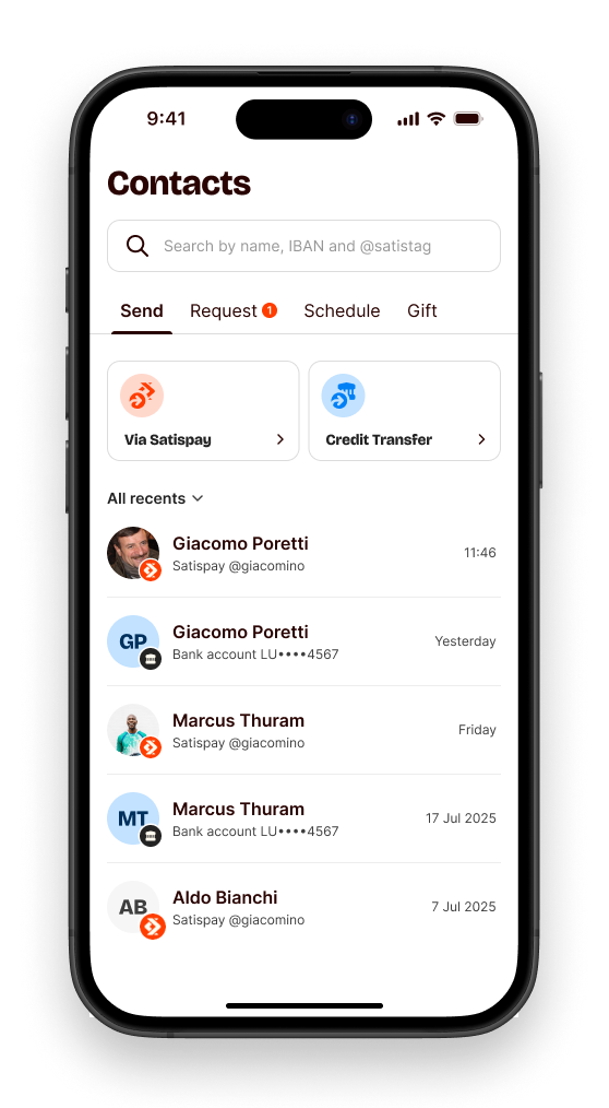
01.Unified hub
One surface for Satispay contacts and saved bank accounts. No more context-switching — one list, one search, one mental model for who you want to pay.
02.Two navigation mental models
Person-first or action-first — we built both entry points. Users can start from a contact and choose the transfer type, or start from the action and pick the recipient. Neither flow compromises the other.
03.Zero learning curve
The SCT flow mirrors the existing P2P experience — same visual language, same interaction patterns, same confirmation rhythm. Sending to an IBAN should feel like sending to a friend.
04.Recap as trust anchor
Bank transfers are larger and irreversible — the stakes are real. A dedicated recap screen puts everything in one view: recipient, IBAN, amount, date, all readable in two seconds. Not friction. Permission to proceed.
Before and after
The feature launched in Q1 2026. Hundreds of thousands of users activated a personal IBAN in the first quarter — with an average transfer well above the P2P baseline. Around 80% of them made a transfer within the same month. Users treat bank transfers differently: they use them for things that matter.
What testing changed
Design for both paths, not just the majority
Users don't share a single approach to the same task. When two patterns emerge clearly from research, design for both — forcing convergence creates friction for everyone.
Reuse what users already know
Familiar interaction patterns lower the cost of learning new features. But each flow has its own nuances — reuse the skeleton, adapt the details where the context demands it.
Predictability is the real design goal
When the experience feels coherent across surfaces, users build confidence faster. Consistency isn't about uniformity — it's about predictability where it matters most.