Gift Card redesign
A feature nobody knew existed
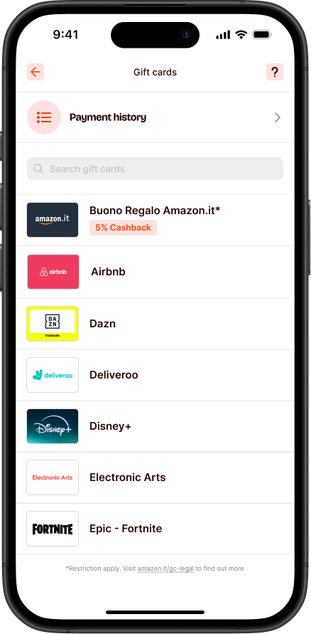
The problem
Satispay sold gift cards with genuine cashback — a real incentive to buy brands users already loved. But the section was nearly invisible: no categories, no editorial curation, no way to discover what was available. Users who arrived without a specific brand in mind had no reason to explore, and most walked past it without ever noticing.
The solution
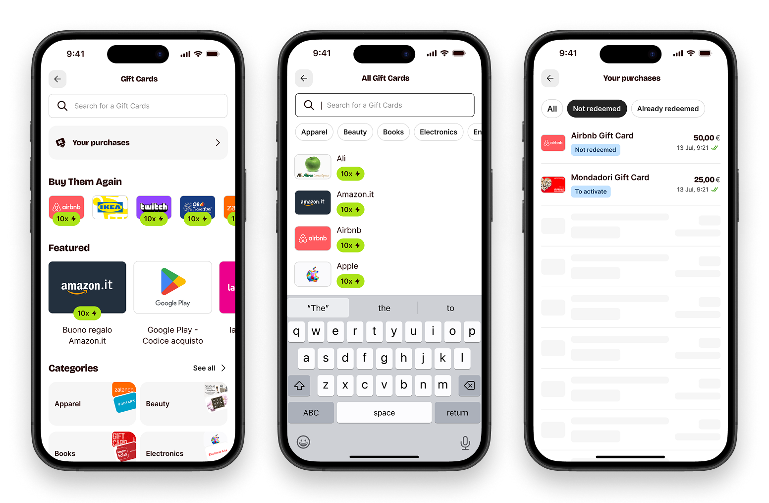
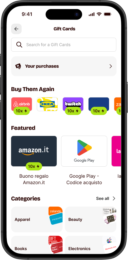
Turn a flat brand list into a browsable store. Categories, editorial surfaces, search, and a clear redemption status — each one designed to give users a reason to explore, not just transact.
Three signals, one clear problem
Low conversion — users drop, rarely purchase
Traffic was landing but not converting. A flat brand list with no orientation gave users no reason to stay — and no signal about where to start.
Converted users can't find new cards
No "new" signal, no categories, no editorial curation. Returning users who'd already bought once had no obvious reason to come back — and no way to discover what had been added.
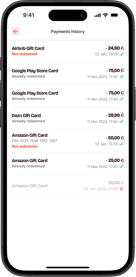
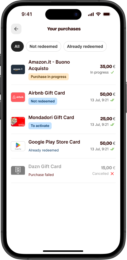
Redemption status is unclear
Post-purchase, users had no clear view of their card status. Customer care received recurring tickets from users who simply didn't know if a card had been used — avoidable support volume, traceable to a single UX gap.
I wasn't sure if my card had already been used. I ended up opening a support ticket just to check.
Customer care · recurring ticketI bought a gift card but couldn't find it afterwards. I didn't even know the section had one.
Customer care · recurring ticketBrowsing as the default
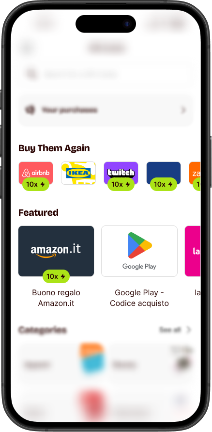
Homepage — clarity and discoverability
The new homepage leads with images, not text. Categories become visual entry points — orient in one glance, tap to explore. Featured cards add editorial weight without relying on words. The structure itself is the reason to come back.
Purchase page — recognisable, filterable
Rich brand imagery now anchors each card — making already-purchased cards instantly recognisable and communicating state (active, used, expired) at a glance. Filters let users narrow by category without losing their place. Cards that were easy to forget become easy to find and use.
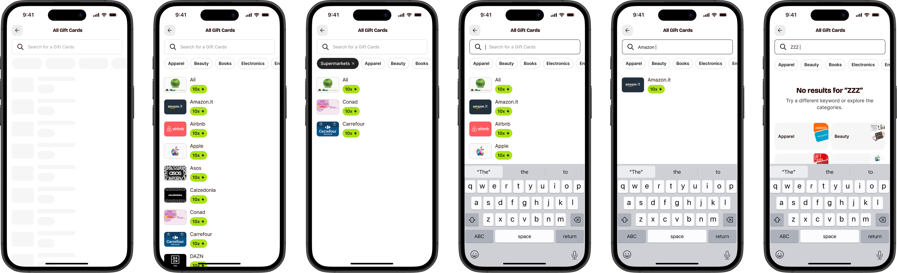
A search flow that never leaves you empty-handed
Search works when you know what you want. When you don't — or when the brand isn't there — the old experience dropped you with nothing. The new flow handles empty states with fallbacks, category nudges, and filtering that keeps you moving.
Decisions that mattered
Two carousels, two user types
Two carousels, two different users. "Most purchased" gives new visitors social proof and a place to start. "Buy again" gives returning users one tap to reorder without re-navigating. Same root problem — low discovery — solved from opposite ends of the funnel.
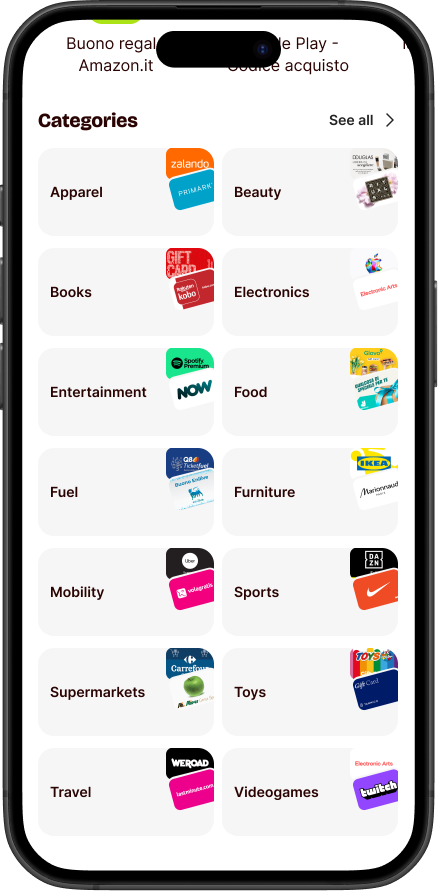
Categories built for scanning
Users don't read a gift card list — they scroll and pattern-match. Categories now lead with brand images: recognisable at a glance, no description needed. The visual system does the filtering work before the user even taps.
What I took away
Structure is a feature
Adding categories didn't just organise content — it created intent. Users browse differently when they have a frame. Without one, even a good catalogue feels overwhelming.
Social proof beats editorial copy
A "most purchased" ranking tells users more than any curated label. It's honest, dynamic, and requires no trust in whoever wrote the headline.
Retention starts in the product
The repurchase carousel wasn't a marketing feature — it was a UX shortcut. Making it easier to come back is as important as making it easy to convert the first time.