0→1 Pay in instalments
Why BNPL, why now
The problem
The global BNPL market hit $316B in 2023, growing 10% annually. In Italy the gap was striking: over 70% awareness, but only 17% adoption. Users wanted instant approval and no income checks — Satispay already had both, with millions of active users and a trusted identity layer. The opportunity was real, but Satispay had no credit product to capture it.
The solution
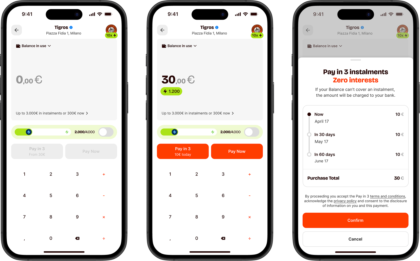
Design a credit product from zero — letting users split any eligible payment into three monthly instalments, directly inside Satispay. Not a redirect, not a third-party widget: native, instant, already trusted.
The constraints
A credit product in Italy means working inside consumer credit regulation from day one. Legal review wasn't a final gate — it was a constant collaborator. Eligibility criteria had to become UX: users who didn't qualify needed a clear, non-punishing explanation. Users who did needed to understand the terms without reading a wall of fine print. Every screen passed through compliance before it passed through engineering.
Staged rollout as a design constraint
We didn't open to everyone at once. Four cohorts gave us real usage data before the next wave arrived — which meant each release was both a launch and a research session. Ship, observe, adjust, repeat.
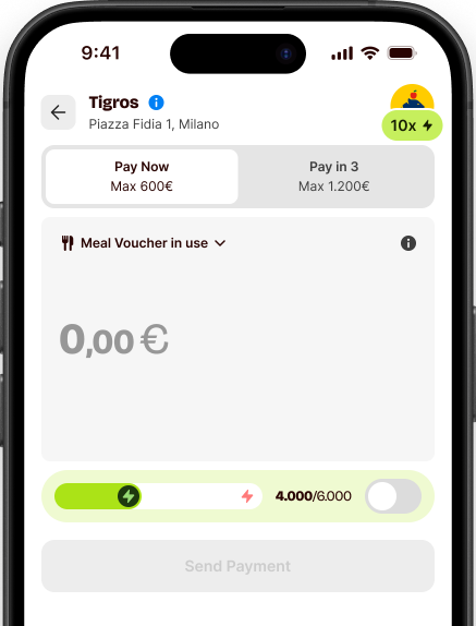
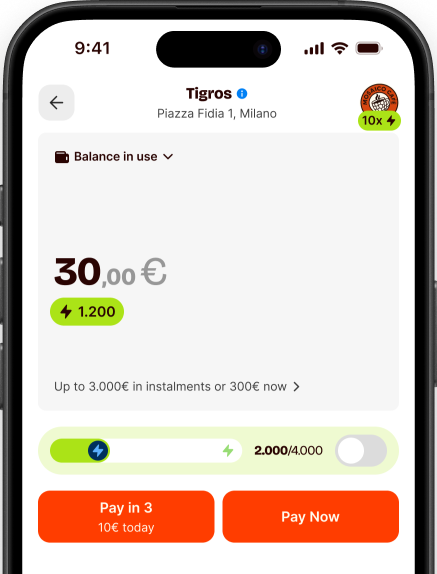
Don't touch the payment flow
The rule from day one: BNPL couldn't touch the standard payment experience. Satispay's core flow is its backbone — any friction added there hits every user, not just the ones considering instalments. 19 participants put the first iteration to the test.
I already entered the amount and tapped pay — I only noticed the instalment option afterwards.
Participant 07 · usability testI found the due date eventually, but I had to look twice to be sure I was reading it right.
Participant 14 · usability testTwo fixes went straight into the next iteration: BNPL needed to appear before the payment confirmation, not after — and the instalment dates needed to be readable in one glance, not two.
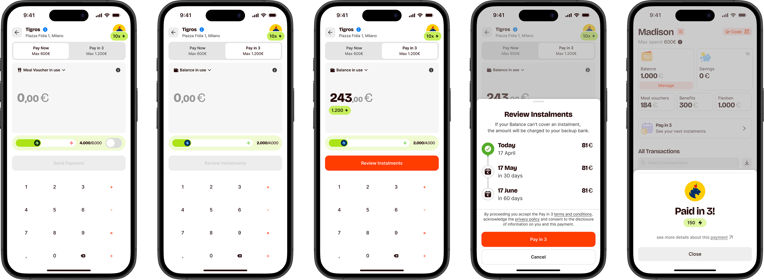
Two versions, one winner
The hypothesis: giving BNPL equal visual weight on the payment screen — rather than hiding it under a tab — would drive more activations without hurting the primary flow. We split a large group of eligible users into two equal groups and ran the test for two weeks, collecting enough data to reach statistical significance across different payment behaviours and days of the week.
Version A
BNPL accessible via tab switch. Clean, but requires deliberate choice to discover.
Version B · Winner
Both options in one view. No tab switch. BNPL becomes a natural part of every payment.
Version B didn't just win — it won clearly. Showing both options in the same view turned BNPL from a feature users had to actively look for into one they considered naturally on every eligible payment. We also tracked the primary payment flow throughout the test — no regression in standard completion rates, meaning the redesign added without taking away.
Where the design lives
Two surfaces carried most of the complexity: the payment flow and the plan detail view. Everything else inherited from them.
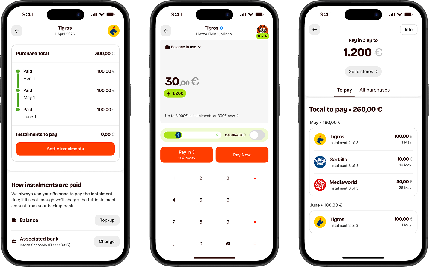
Payment flow
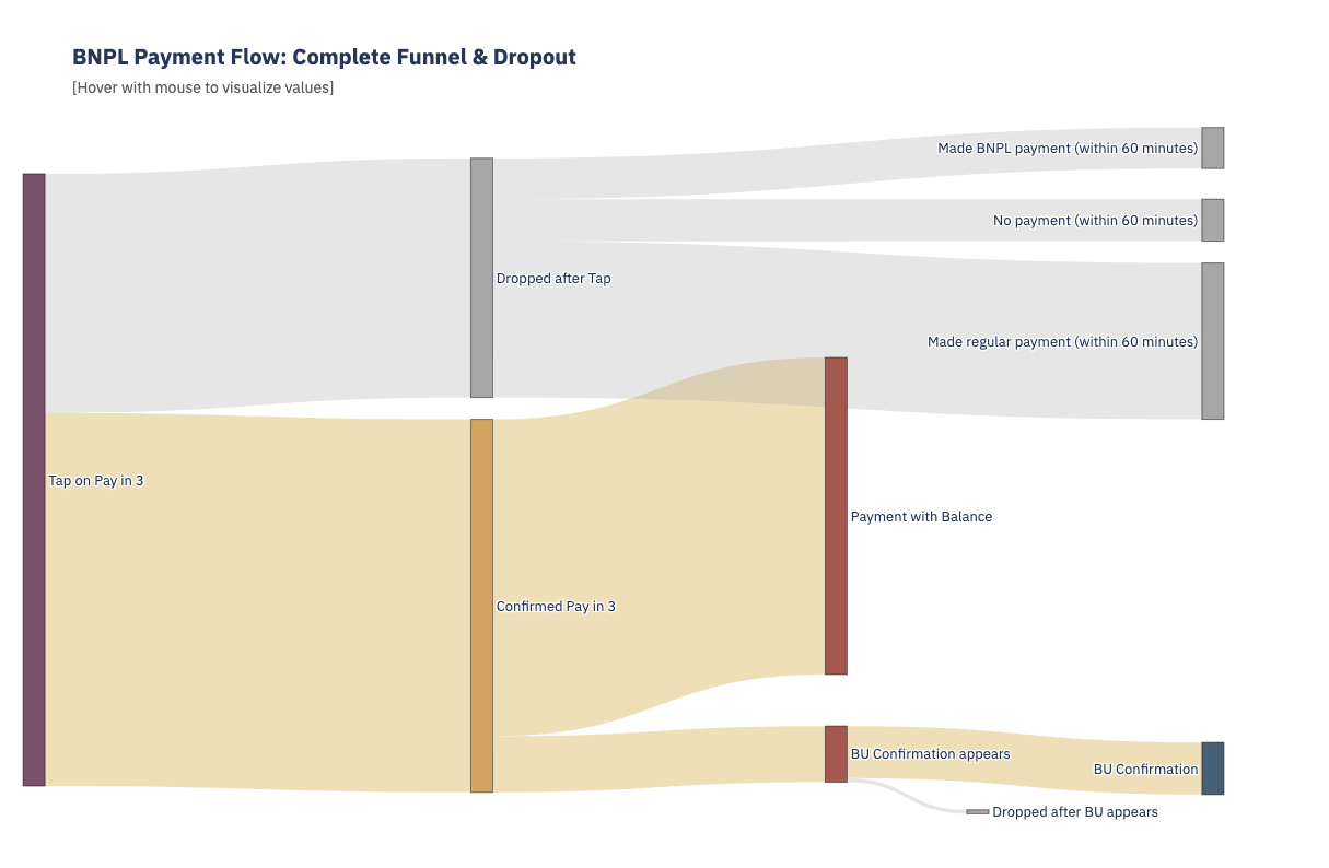
A Sankey diagram tracked drop-off and conversion at every step — from eligibility check through plan creation to confirmation. Seeing exactly where users abandoned the flow was the fastest way to decide what to fix before the next wave. The constraint underneath it all: each step had to feel as fast and familiar as a standard Satispay payment. No extra cognitive load, no detours into fine print.
Status management
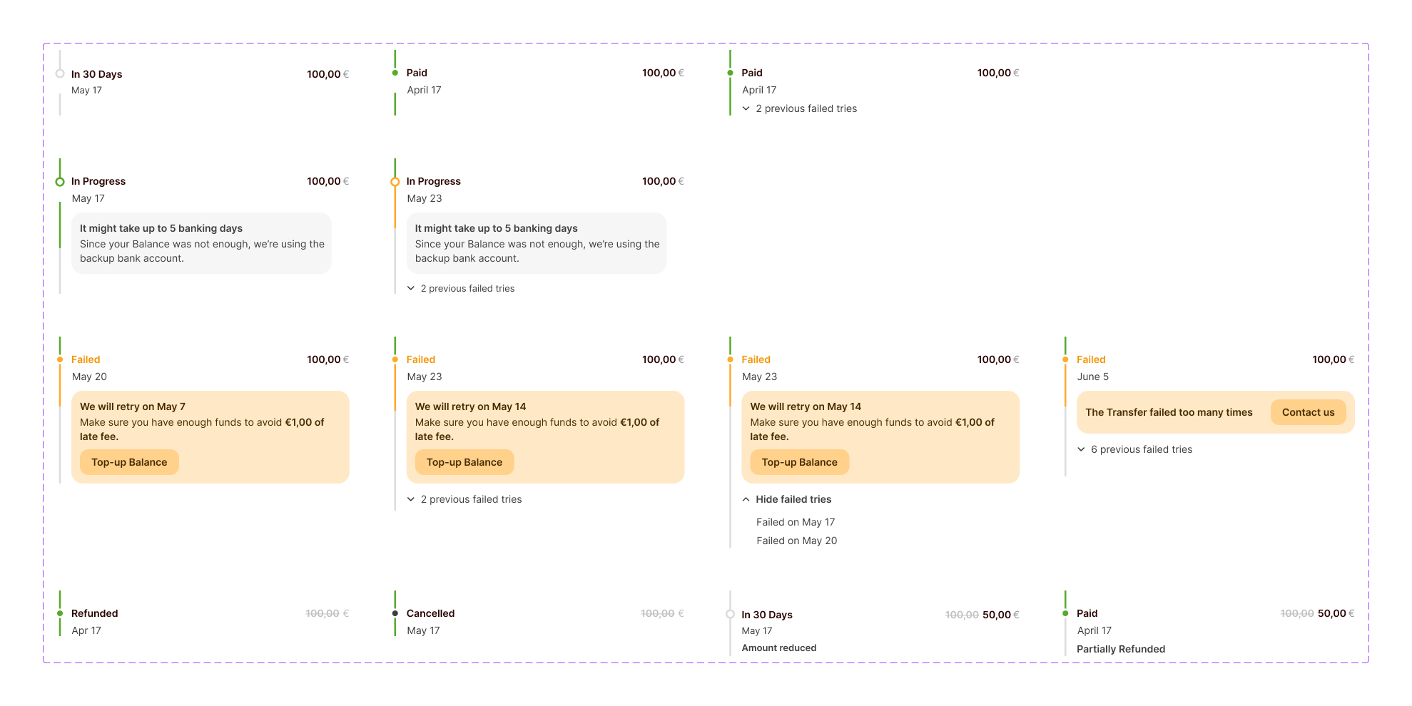
Real edge cases drove the state count to seven: Pending, Active, Completed, Overdue, Rejected, Cancelled, Suspended. Each state got a distinct colour, icon, and label — then the same visual language had to propagate across every surface: homepage card, plan detail, transaction entry. Define it once, apply it everywhere, leave no room for ambiguity.
What users asked for next
The MVP answered the core question: can users split payments easily? Yes. Real usage immediately surfaced the next ones. Customer care tickets became the clearest signal we had — more honest than any survey, because users write in when something actually matters to them.
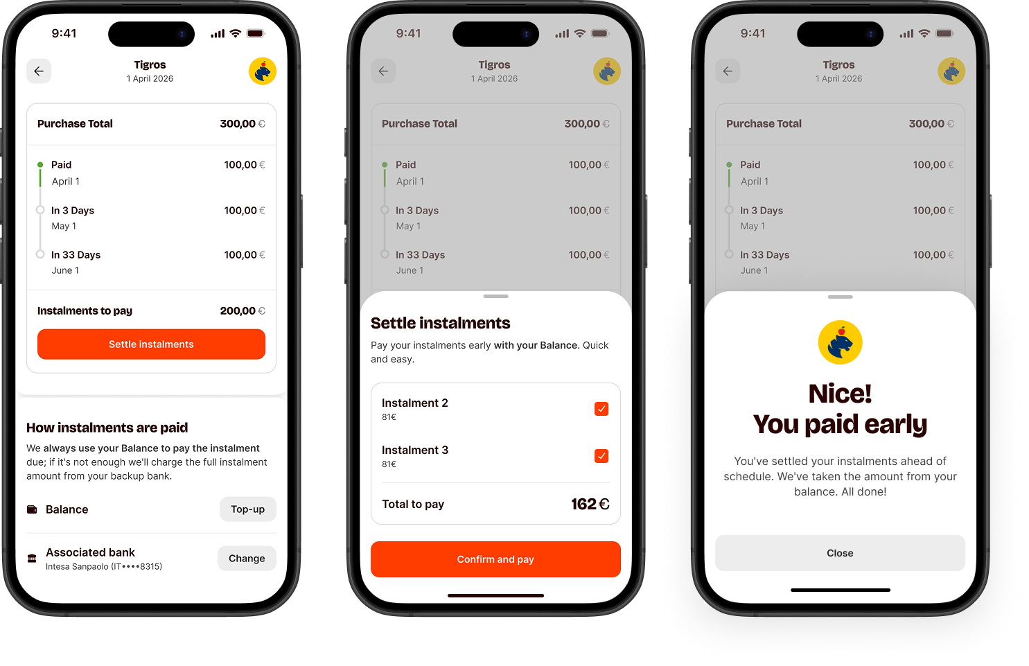
Can I pay off the remaining instalments all at once? I'd rather just close the plan early.
Customer care · recurring requestI set up an instalment plan by mistake — I meant to pay in full. Is there any way to close it?
Customer care · recurring requestEarly settlement
Those tickets became a feature. Paying off remaining instalments ahead of schedule — as much a trust signal as a product capability. Users want to feel in control of their own plans, not locked into a schedule. Customer care surfaced the need; design made it frictionless.
The product is live and generating signal every day. What comes next stays under wraps — but the direction is clear: more flexibility on timing, more control in users' hands, more ways to split.
What broke my assumptions
The things I was most confident about broke first
User testing and A/B results surfaced things I couldn't have reached designing alone. Every assumption I was most confident about was exactly the one that needed the most work.
Staged rollout is a design tool
Each wave was a feedback loop. Things I was confident about at launch didn't survive contact with 50k real users. Iterate between waves, not just before them.
You can't force users
Half of active BNPL users return every week — they chose it and kept choosing it. The rest didn't convert despite every friction removed. Design can lower barriers, but it can't manufacture intent. Build for the people already willing, and earn the others over time.